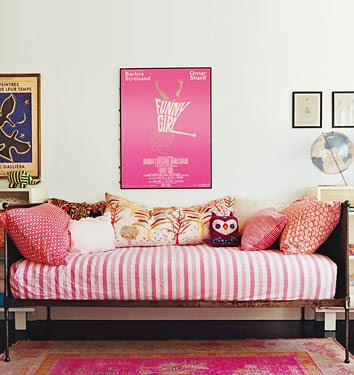
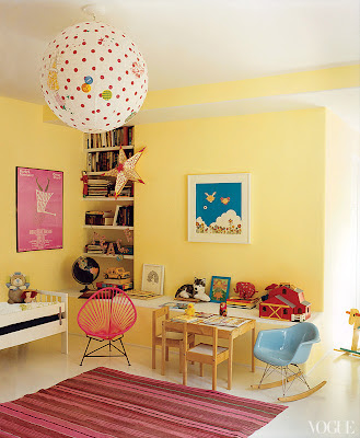
This is her daughter's room. Mixing patterns is definitely an eclectic feature, but when you ground the patterns with a common color (in this case pink) and keep the size of the patterns small, it gives the room a cohesiveness.
This is her daughter's room now, which was featured in the 2012 issue of Vogue. The adorable Funny Girl poster is still present. The pink hoop chair, the Murakami print, the polka dotted paper lantern and the baby blue kid's size Eames rocker all complete the bohemian, retro and modern look.
I love this breakfast nook with the mix of industrial and classic. The metal chairs bring the industrial and the wooden table and glass chandelier bring the classic. The colors work together well in this room to bring out the brightness and airiness. I can picture myself sitting here reading the morning news and drinking some hot cocoa (that is if Amanda Peet didn't live here, otherwise that is kind of stalker-ish).
How do I love thee bathroom? Let me count the ways: (1) subway tiles; (2) pedestal sink; (3) gray claw foot tub; (4) floral wallpaper; (5) vintage white cabinet; (6) wicker basket; and (7) prints above tub to add to charm.
The best thing I love about this home is that it looks welcoming and lived in which is what I believe a home should be.
(photos via Mimi + Meg and If the Lamp Shade Fits)


I love her dining room area! There's something about a sofa bench around a table that is so comforting and inviting!
ReplyDeleteYeah, I've always wanted a banquette in a breakfast nook - I like the coziness of it as well.
Delete